Time to change the iTunes icon
July 12th, 2010Apple’s iTunes icon has remained relatively unchanged since it’s release 10 years ago: a CD with music notes in front. The number and colors of those notes have changed, but overall the icon has stayed the same.
Isn’t it interesting, then, that some Mac users pick on Microsoft for using the floppy disk for saving files (rightfully so, I think) when Apple, who is speeding past the physical media age, relies on a flat disc of plastic to identify it’s media app?
From the days of “Rip, Mix, Burn,” Apple has encouraged users to think beyond the compact disc. With the iPod and the iTunes Music Store, our media could be captured in bits and bytes, 1s and 0s, not rotations of a disc over a laser beam. And since the post SoundJam days, iTunes has become a home for other media besides music – like books, movies, games, and podcasts. Arguably, it’s still mostly about music. But more and more iTunes has become a hub for the digital lifestyle – a homebase for all our media.
So why stick with the CD on the icon?
Recently, I read a Rolling Stone survey that said most people still get their music from CDs (I’m one of them). Record albums are becoming popular again, and legal MP3s are a close second, but more than 87% of music buyers still get their music from compact discs. With all the talk of the electronic media age, I found the survey results surprising.
But still, iTunes is becoming less and less about tunes and more about all manner of digital media. It’s hard to parse the “tunes” part of iTunes when you combine it with books, movies, TV shows, games, and iPod/iPhone management. The tunes are just one part of a collection of consumable entertainment.
Is there a good enough case for Apple changing the icon? Or is it so ingrained in popular culture that any change, like the floppy disk in Microsoft Office programs, will be unwelcome?
Think back to when Apple revamped iMovie, with the new icon.
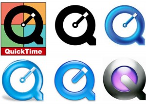
Or QuickTime X – quite a change from the nearly-20-year-old QuickTime logo before it (above – courtesy of The Logo Factory).
It’s not like Apple is afraid of change, visually or philosophically. In the case of hardware, it’s usually revolutionary (think iMac G3 to iMac G4). Even OS X has undergone a few visual transformations over the years. Why leave the iTunes icon unchanged after so long?
Maybe the question is, what could replace the current iTunes icon?

