As reader Joseph said, I kind of asked for this one, didn’t I?
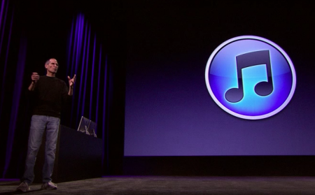
The new iTunes 10 icon is nice. It fits with the rest of the circular, glowing orbs that Apple trots out these days. It’s simple and clean, and has the old-school Aqua look to it.
And as Steve said during the keynote, the CD era is about to be eclipsed by everything digital. With version 10, now is the time for a change.
Hmmm… remember when Apple made fun of Microsoft for making the Windows logo an orb?
Posted by Matej Horvat on September 2nd, 2010.
That was a stolen Aqua orb. This one was made by the originator.
Posted by davelawrence8 on September 2nd, 2010.
I’m fine with bland, uninspired blobs as icons on the iPhone/iPad, but I really hope this isn’t a sign of things to come. Apple’s logos are some of the best ever made, and I don’t like the idea of my dock becoming a row of colorful blobs. I’m just glad there is still a way to replace the default icons, so my iTunes 10 still looks like iTunes.
Posted by obi1kenobi1 on September 4th, 2010.
I admit that I think the new icon is nice, despite what some say. My biggest problem with it is that it makes me feel older — have we actually progressed beyond CDs, a format that was all the rage during my childhood in the 1990s? :)
As soon as I saw the new icon during Steve’s keynote, I thought of the posting here predicting the end of the old icon.
Posted by Joseph on September 11th, 2010.
I don’t see how you can possibly like that cartoonishly bent beam between the quavers. And using the curved glass ‘lens’-ish effect in that way is just iOS, not Mac. What’s with the circular gradient? Why the grey rim? Anyway.
Posted by David Kendal on September 11th, 2010.