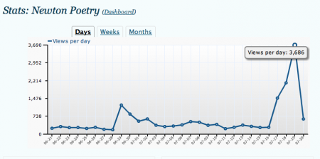
What you’re looking at is the high crest of some Mac appreciation wave that is only now breaking.
I posted my Apple.com, circa 1983 picture on June 29 – three days after sharing it on Flickr. Since then, the image has been shared on numerous blogs (including one of my daily reads), and has spread around the world. It’s been an honor to see how this little project took off.
To give you an idea, Newton Poetry typically earns anywhere from 300-700 hits on an average day. For those days that I publish something to Macsurfer, that number can reach into 1,000 or so. But that’s only happened a few times.
Hitting 3,600 hits in a day, however, is unheard of for this blog. It’s madness. And it’s humbling.
The funny thing is, I had a feeling it was coming. Something told me that drafting a snapshot of Apple’s make-believe 1983 web site, something I hadn’t seen anyone tackle before, would be something people could enjoy. But 43,000 views and 30 comments on Flickr (and counting) tells me it reached those Mac fans, like myself, that love the retro kitsch stuff.
Here I thought the first day’s traffic, that little spike you see on the left, was big news. Then things creeped down back to normal, when Cult of Mac wrote about it and – BOOM – off it went. My biggest source of traffic has come from some German web sharing service Swedish blog network that I’ve never heard of. Amazing.
Looking at it almost a month later, there’s some things that I would change about the mockup. For one, someone pointed out that I had the wrong Apple II at the bottom. I’d like to mess with the kerning a bit on the headlines.
Also, some have suggested that I should have used Apple’s old serif font (what would become a modified version of Garamond) for the typeface. But I hate that typeface, and I wanted to keep things simple and more modern. Besides, the picture was thrown together on a Thursday night, the product of an idea and some Google Image searching, and is by no means an accurate representation. It only shows what one could do with Apple’s iconic web site design.
Most of all, my little project has shown the power of the share-able web. After I posted the mockup and Twittered it, the thing spread immediately to blogs and re-Tweets, and started generating unheard-of levels of traffic to this site.
So thanks to everyone who chimed in, shared the picture, and visited this site. I hope some of you will stick around, because I do love me some classic Macintosh, and Newton, and am willing to do more of this kind of thing.
I have a Newton launch day version of Apple.com swimming in my head as I type.
