Thomas Brand at Egg Freckles gives us a history lesson in Apple skeuomorphism, all the way back to the beginning:
Before the Mac there was no skeuomorphism, because there was no graphical user interface. For almost thirty years the iconography of desktop objects have greeted users as they stare into their computer screens. The desktop metaphor has given new computer users a familiar foundation to ground their experiences upon, and expert users terminology such as “files” and “folders” we still use today.
Brushed metal, DVD players, and even the calculator – Brand shows that skeuomorphism is nothing new for Apple.
Even the Newton had its share of skeuomorphism, with the lined paper metaphor greeting us in the Notes app.
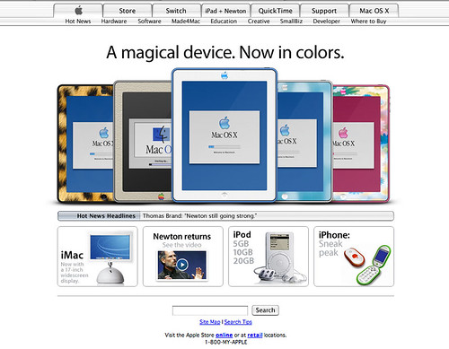
We had so much fun watching all of Thomas’s retro iPads come through that, shucks, why not make a retro Apple.com page again? So there you have it: Apple.com, circa never.
This time, I used the OS X 10.2 Jaguar-era Apple.com, with a fun iPhone fake mockup and an announcement that will never, ever come.
As far as the iPad goes: the white iPad 2 is the first time I’ve actually considered wanting an iPad. I still don’t have an iPad-shaped hole in my life, and the $499 could be used more productively in a lot of other places, but who knows. It’s a wonderful-looking product, and put me down as a fan of the white versions of Apple’s mobile devices.
Mac software geniuses Panic posted some quick little notes about Transmit 4 on their blog, and one of those little ditties was how to customize the icon for each connection. They provide 16 icons to get you started, but also offered a tip on an Iconfactory set.
Here’s what my customized Transmit icons look like:
Pretty cool, especially considering The hello Show is a classic Mac podcast (sort of), and the Newton Poetry icon is a little eMate. These come from the excellent World of Aqua icon set by Dave Brasgalla, dating from 2001. The set includes all kinds of great semi-classic (G4 era) hardware, along with a few Newtons:
Brasgalla made a whole series of these, some including the best hardware Apple’s made, and they all take you back to the early days of OS X.
I’ve never been a big icon customizer, but playing around with Transmit and setting some custom icons for things like my USB thumb drive and even Automator and AppleScript applications has been a lot of fun.
With the G5 iMac, Apple got things just right. The optical drive and USB ports are right there with the monitor, and it’s a design we can expect Apple to stick with as long as there are desktop PCs.
As much as I love the iMac G4, I’m inclined to believe him: the G5 and beyond iMac design is one that’s built to last. Even today’s aluminum iMacs are basically the G5 fancied up.
The one thing I wouldn’t mind changing is the layout of the ports on the back. It is kind of a pain to reach around and pull USB dongles out. Maybe put them under the chin? Or on the side? I don’t know, but putting the ports on the back is clumsy.
But the G5 design is simplicity at its best. People talk about the iPad being a “window” into the Internet world; I feel the same way about my iMac. The screen, the Apple logo underneath – and that’s it.
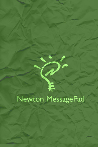
I always think of the Newton in olive-toned colors – but my own MP110 is flaking along the edges, exposing a brighter green under that grippy surface layer.
As of now, the links all say “Coming Soon!” But man, wouldn’t it be cool to work out all the Apple Lisa or BASIC copy for a functioning (albeit fake) retro Apple.com?
In my original retro Apple.com post, I asked for others to take memorable moments in Apple’s history and mockup a web site.
Matt Pearce did just that, as you can see, making five total Apple.com homepages at different points in history. Particularly notable: an Apple I version with the original Apple Computer logo.