Posts categorized “design”.

Apple.com, circa 1993

January 11th, 2010

Apple.com, circa 1993

Here’s the tablet before the tablet.

With all this talk of a tablet-type device set to descend from the foggy Olympus of Cupertino, I thought it might help to look back at Apple’s first flat computing device.

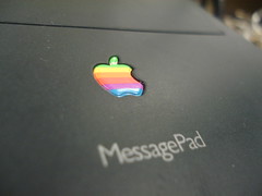
Yes, about 17 years ago Apple Computer released the original Newton MessagePad (OMP, or MessagePad 100). In August 1993, the company introduced a crude version of then-CEO John Sculley’s “Knowledge Navigator” concept. It was arguably the first personal digital assistant.

So I dreamed up what Apple.com might have looked like at the Newton’s launch in 1993, 10 years after my original retro Apple.com site featuring the Lisa in 1983.

This comes at the tail-end of the John Sculley era, right before the Mac PowerPC era, in the murky past when System 7 roamed the landscape and the PowerBook was changing the way we viewed laptop computers.

Behind the scenes, Apple was in full tablet mode. They saw it as a potential post-Mac future.

Back on the ground, Apple was having trouble seeing its dream become a reality. The OMP’s launch was plagued with problems, lowered expectations, and tragedy. But the idea – that you could do your computing and personal data management on the go – became reality, and it required a stylus.

Like the iPhone lacking its App Store, the Newton wasn’t fully operational at its August 1993 launch. Handwriting recognition was still iffy, and NewtonMail wasn’t operational yet. Some would argue that the Newton platform didn’t reach its true potential until the Newton OS 2.0 was released and the MessagePad 2×00 series came around. By then, however, the Newton brand had been stained, and the PDA line was finally killed by Steve Jobs in 1997.

For this retro Apple.com, I bowed to popular demand and used Apple’s skinny version of Garamond. I much prefer the new Myriad variation Apple uses, but some said the Garamond would look more authentic. So here it is.

The site also shows what was happening in the Apple ecosystem in 1993: the Mac TV would be released later in the year, the Power CD (both a music CD player and a CD-ROM for Macs) was the newest gadget, and capable Macs like the affordable LC III ruled the Macintosh world.

With all the talk of a rumored tablet, let’s not forget that, once upon a time, Apple had a tablet-style computer that ran apps, held ebooks, let you check e-mail, and managed your personal information. Now we use smartphones, but at the time the PDA was the closest thing to a tablet we could get.

Also remember: while the Apple press and public are busy waiting for some rumored tablet, there’s a big group of people out there using the original Apple tablet.

Grab your Newton desktop wallpaper

December 21st, 2009

'Newt' by Grant Hutchinson

A little Christmas present for you: Grant Hutchinson has created a Newton-ized desktop wallpaper for your computer over at Simple Desktops.

Splorp has posted a few other simple desktops on the site, too – be sure to look for them.

Thanks Grant!

Mac Plus for design work

September 29th, 2009

Mac Plus

“If you look at the some of the work done in the early to mid-eighties you can see the limitation. We finally got a 512k machine, the Mac Plus, which is how Design Quarterly was done. We used MacVision, which was a little beige box that hooked up to a video camera and ported right into the Mac. You could scan over an image and it was tiled out. We kept moving the camera, scanning and repeating.”

April Greiman, designer, in an interview on idsgn.org.

Perhaps the quality wasn’t all there, but Greiman’s interview shows that even the lowest end of the low end Macs were capable of design work. Great two-part interview.

Newtonpoetry.com: the rough draft

August 28th, 2008

Newton Poetry on paper

Someday Newton Poetry will have its own domain name, after a certain goal has been reached.

Before that happens, however, I have to draw up a plan. So that’s exactly what I did. If and when Newton Poetry becomes newtonpoetry.com, I’d like to stick with WordPress and do a customized blog. A Newton-looking theme would be great – not on par with some blogs, but sporting a MessagePad-ish theme would fit in nicely.

The rough draft above shows a basic outline of what this site could become.

  1. The overall site would look much like the Newton’s screen looks: a dock at the bottom, notes in between (the blog postings) and icons that mimic the MessagePad’s. Each day’s post could include the little Newton clock and date, with the envelope icon for comments. Something like that.
  2. My original idea for this site was to include the stylus somehow, but on newtonpoetry.com it’ll be a must. But no green. The header, the site, the posts – all on a nice clean white. Maybe some of the icons can be green.
  3. Ah, the sidebar. It’ll have the requisite “archive” and “blogroll” and all the goodies, and maybe some space for an ad or two. This could, possibly, be the spot on the site where green plays heavily, just to set it off from the main body of blog posts.
  4. Here’s the dock. It’s a must, I think, and it could be a great spot for archives and such in place of the sidebar. It’s hard to find good, high-quality images of the Newton’s screen, but if I have to I’ll simply recreate the icons. This may be where I put links to the “About” page and my upcoming “Links” page.

That’s the plan so far. I’ll still have to learn a thing or two about installing WordPress on a host, and how to manage themes, but it can be done. And now I have a basic outline of how I want things to look.

Any suggestions?

Wired’s Apple-inspired design

March 26th, 2008

DSC04431

Leander Kahney, author of the Cult of Mac blog, got a cover piece wondering if Apple is an evil genius (and it’s caused quite the reaction).

What caught my eye, however, was the binding on the cover of the magazine. Notice anything?

Look here:

DSC04429

Wired had a bit of fun with the old-school Apple logo colors – placing them in the original order, even.

I didn’t even notice it when my subscription edition came, but today I sat at my desk, turned around, and *BAM* it hit me. The old Apple rainbow.

Say what you will about Wired pimping their writers’ upcoming books, or their stance on whether Apple is “evil” or not (because they do things differently?), but their design is fun. If you’re not an Apple fan, you may not have even noticed the subtle clue.

In spite of everything, thanks for the nod, Wired.