Posts tagged “design”.

Newton quote of the week: design victories
November 11th, 2009“We had some little design victories, like the eMate or the 20th Anniversary Mac. But they were never mainstream products. It was incredibly frustrating.”
– Apple lead designer Jonathan Ive, on the unoriginal design of Apple products during the ’90s.
[Via System Folder.]
Mac Plus for design work
September 29th, 2009
“If you look at the some of the work done in the early to mid-eighties you can see the limitation. We finally got a 512k machine, the Mac Plus, which is how Design Quarterly was done. We used MacVision, which was a little beige box that hooked up to a video camera and ported right into the Mac. You could scan over an image and it was tiled out. We kept moving the camera, scanning and repeating.”
– April Greiman, designer, in an interview on idsgn.org.
Perhaps the quality wasn’t all there, but Greiman’s interview shows that even the lowest end of the low end Macs were capable of design work. Great two-part interview.
Office Mac: iMac fits right in
March 5th, 2009
Isn’t it wonderful how well the G5 and newer iMacs fit into a modular workspace like the one above?
Check out more great workspaces at The Shelby.
[Via ISO50 Blog.]
Newtonpoetry.com: the rough draft
August 28th, 2008
Someday Newton Poetry will have its own domain name, after a certain goal has been reached.
Before that happens, however, I have to draw up a plan. So that’s exactly what I did. If and when Newton Poetry becomes newtonpoetry.com, I’d like to stick with WordPress and do a customized blog. A Newton-looking theme would be great – not on par with some blogs, but sporting a MessagePad-ish theme would fit in nicely.
The rough draft above shows a basic outline of what this site could become.
- The overall site would look much like the Newton’s screen looks: a dock at the bottom, notes in between (the blog postings) and icons that mimic the MessagePad’s. Each day’s post could include the little Newton clock and date, with the envelope icon for comments. Something like that.
- My original idea for this site was to include the stylus somehow, but on newtonpoetry.com it’ll be a must. But no green. The header, the site, the posts – all on a nice clean white. Maybe some of the icons can be green.
- Ah, the sidebar. It’ll have the requisite “archive” and “blogroll” and all the goodies, and maybe some space for an ad or two. This could, possibly, be the spot on the site where green plays heavily, just to set it off from the main body of blog posts.
- Here’s the dock. It’s a must, I think, and it could be a great spot for archives and such in place of the sidebar. It’s hard to find good, high-quality images of the Newton’s screen, but if I have to I’ll simply recreate the icons. This may be where I put links to the “About” page and my upcoming “Links” page.
That’s the plan so far. I’ll still have to learn a thing or two about installing WordPress on a host, and how to manage themes, but it can be done. And now I have a basic outline of how I want things to look.
Any suggestions?
Mobile OS X: are the pinstripes back?
July 31st, 2008
In the G3-G4 Mac era, pinstripes were everywhere.
Look at the front of a G3 iMac, or an Apple Studio Display (CRT or flat screen), or even OS X up until Panther. Even the classic Mac OS had pinstripes on the tops of windows, and the pre-Power PC Macs had pinstripes as a rule.
We shouldn’t be surprised, then, to find pinstripes creeping back into the Mac OS. But the iPhone OS X? Take a look:

I found that shot in the Contacts app, but pinstripes can also be found in the iCal app (try adding a new appointment), the Settings, and even the Clock (the map in the background). Now the iPhone’s pinstripes are a little thicker and more prominent than OS X’s. Check this preference pane from Jaguar:

Takes you back, doesn’t it?
With its darker hue and thicker lines, the Mobilie OS X goes for a more professional and buttoned-up look, much like OS X 10.5  Leopard, than the lighter, “lickable” OS X of yesteryear. The pinstripe motif is mostly a simple backdrop to app screens displaying boxed areas of information (iCal, Settings). But also, the vertical stripes lend to the iPhone’s mostly vertical orientation. Granted, the pinstripes only appear here and there (I noticed the scheme in a few apps, like UrbanSpoon, too) – instead of everywhere with OS X 10.0 and beyond.
The more unified look of Leopard begins to break down in areas like this, much as Panther and Tiger only used the brushed metal design willy-nilly.
I agree with John Siracusa: using OS X 10.2 Jaguar on my iBook G3 is a “jarring” experience: the clunky finder, the toy-ish polish on buttons and tabs, and all those pinstripes.
Now they’re back, in iPhone form.
[Jaguar screen shot courtesy of Ars Technica.]
Wired’s Apple-inspired design
March 26th, 2008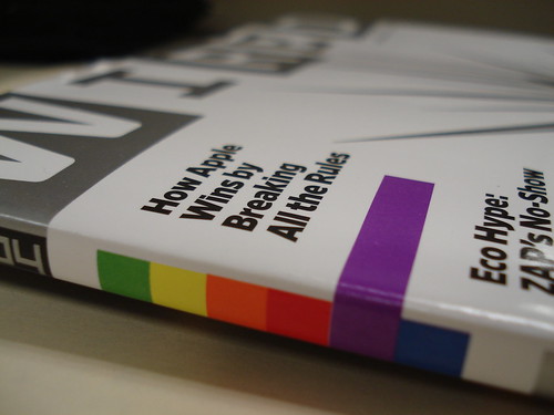
Leander Kahney, author of the Cult of Mac blog, got a cover piece wondering if Apple is an evil genius (and it’s caused quite the reaction).
What caught my eye, however, was the binding on the cover of the magazine. Notice anything?
Look here:
Wired had a bit of fun with the old-school Apple logo colors – placing them in the original order, even.
I didn’t even notice it when my subscription edition came, but today I sat at my desk, turned around, and *BAM* it hit me. The old Apple rainbow.
Say what you will about Wired pimping their writers’ upcoming books, or their stance on whether Apple is “evil” or not (because they do things differently?), but their design is fun. If you’re not an Apple fan, you may not have even noticed the subtle clue.
In spite of everything, thanks for the nod, Wired.
Header under construction
March 11th, 2008Forgive the header changes – I’ve been playing around with a custom look for Newton Poetry.
The one above is the one I’m leaning to, but maybe you saw yesterday’s header and liked it better:

Let me know. I’ve also played around with a parchment-style header, to go with the “poetry” part of the site:

I like changing the theme to fit the season, or the holidays, so the current masthead won’t be around forever. Maybe when I pick a style I can keep it as the default, and switch things up periodically. One of these days, I’d love to abandon the template design and break out with my own CSS wizardry (something I’m learning, and I do own the “newton poetry” domain.)
Any blog header stylists out there want to take a shot at it, I’d love to see your work.
Blogging as a Newton.
November 8th, 2007Holy moly.
There’s a blog I just found, called simply “My Newton Blog,” that’s shaped like a Newton.
Shaped. Like. A. Newton.
The only part I can’t figure out is how to scroll down through the individual blogs. Going from blog to blog is easy. But reading a blog that’s continued past the viewing point is beyond me.
Thomas Brand, the blog’s author, asks a great question – about the need for a walk-through for modern Newton users like me – and maybe that’s something I can get to. A step-by-step process for getting a MessagePad up and running, from purchase to everyday GTD.
I’ll contact Thomas and learn more.