Posts tagged “G5”.

Apple’s White Period

July 9th, 2013

Apple eMac

Andrew Kim has a lovely collection of Apple’s “white period” Macs over at his blog, Minimally Minimal:

The designs of this age were so calm, warm and pure, despite the brutally honest and analytical design. I especially love the way the clear layer interacts with the opaque white inner shell.

Agreed. And while Kim includes the G5 iMac in his Mac trio, I’d throw in the lovely harbinger (along with the eMac) iMac G4.

The current aluminum lineup of Macs makes for good design as well, but “white” says “Apple” to my mind. And I’ll always favor white Apple products: the iPhone, iPods, etc.

It’s not always a practical design choice, as Kim points out. A lot of these Macs show their age because of smudges and scratches. I think it’s worth it, to have that gleaming white machine brightening up a room.

The perfect design: iMac G5

September 13th, 2010

Dan Knight at Low End Mac makes a bold statement:

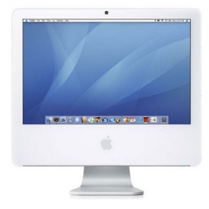
With the G5 iMac, Apple got things just right. The optical drive and USB ports are right there with the monitor, and it’s a design we can expect Apple to stick with as long as there are desktop PCs.

As much as I love the iMac G4, I’m inclined to believe him: the G5 and beyond iMac design is one that’s built to last. Even today’s aluminum iMacs are basically the G5 fancied up.

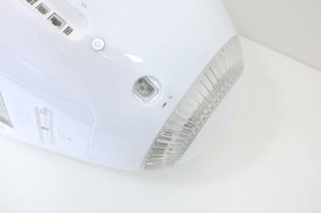
The one thing I wouldn’t mind changing is the layout of the ports on the back. It is kind of a pain to reach around and pull USB dongles out. Maybe put them under the chin? Or on the side? I don’t know, but putting the ports on the back is clumsy.

But the G5 design is simplicity at its best. People talk about the iPad being a “window” into the Internet world; I feel the same way about my iMac. The screen, the Apple logo underneath – and that’s it.

iMac in the home office

August 18th, 2009

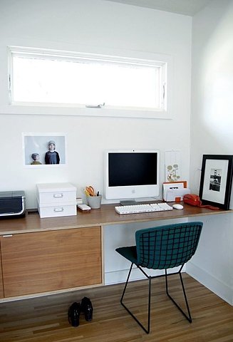
iMac in the workspace

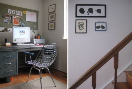
Another entry from the “iMacs in the wordspace” desk – this time either a G5 or Intel Mac.

Love the chair, but I wonder how comfy it is?

[Via Design Sponge.]

‘Where I write’ – Sci-Fi workspaces

June 8th, 2009

wiw-peter-straub

Author Peter Straub at his workspace, using either a G5 or Intel iMac.

The Where I Write project has a bunch of great sci-fi author photos taken in their workspace by photographer Kyle Cassidy. I always find it fascinating to see where other people do their creative work. How many Macs can you spot?

[Courtesy of Neil Gaiman.]

Office Mac: iMac fits right in

March 5th, 2009

alexander_wang1153

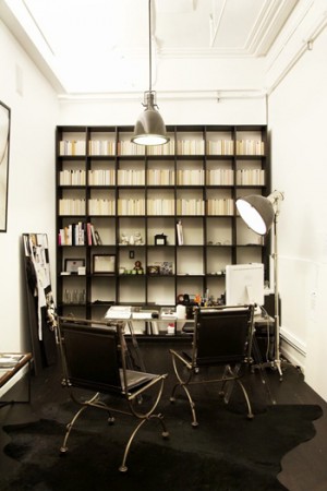
Isn’t it wonderful how well the G5 and newer iMacs fit into a modular workspace like the one above?

Check out more great workspaces at The Shelby.

[Via ISO50 Blog.]

iMacs make for great workspaces

January 20th, 2009

imacg5desk

Another example of an iMac used in an office, with great effect. Last time it was a G4 (my favorite). This time, either a G5 or an early Intel iMac.

The workspace, from Apartment Therapy, is an example of a “floating desk” design for cramped offices.

I like how the iMac’s screen seems to float in mid-air, too, with the white body of the iMac blending into the wall behind it.

Which makes me wonder: will we see computer screens hung on a wall, like high-def TVs are now? Would you run the cords through the wall, so it appeared to float? I’d love to see one.

New Macs copy Apple gadget design…again.

October 15th, 2008

It’s interesting that Apple chooses to transfer the look and feel of its gadget line into the Mac aesthetic, especially with its new line of notebooks.

The iMac G3 and G4 stood out on their own. They didn’t look like anything that came before them. The iBook G3, when it was released, copied the iMac G3 design (and maybe a bit of the eMate look), unifying the consumer model Macs:

The iMac G4 (see below) was a pioneering design. Then Apple released the iPod, and suddenly the iMac G5 took on its design:

The promotional video for the new iMac said so itself: the rounded corners, the brilliant white, the giant color screen – all of it in homage to the iPod.

Since then, Apple has unleashed the iPhone, with its reflective glass, aluminum casing and black borders, onto the world:

Sure enough, the Macintosh line was soon to follow. First the (admittedly sharp) aluminum iMac:

And now the new MacBook and MacBook pro (with the Air):

Apple seems to take the consumer line of Macs and make them look like whatever new handheld device that’s hot that year. Even the new 24″ display follows this trend. The only Macs to resist these choices are the Mac Pro and Mac Mini, but that’s only because they were metal to begin with.

(An aside: what would a Newton-inspired Mac look like? Would it be a rubberized green?)

The unification scheme makes the hardware sharp and easy to market, but some choices should be optional – like the glossy-only screen option. Sure, slick glass looks great on the iPhone, but on a graphic design machine like the MacBook Pro? Some color-conscious designers are non too pleased.

I don’t have strong opinions either way. The consistency across the Mac line makes aesthetic sense, and helps us distinguish between revisions. The G3 line, for instance, featured translucent, colored plastic (except for the PowerBooks). The G4 line had smooth gray (PowerMac and PowerBook) or ice white designs (iMac and iBook):

The Intel era has featured a mish-mash of the G5 designs and the new, iPhone-inspired Macs. As it stands now, the iMac, Mac Pro, Mac Mini, the new display, and the portable line all hold up to design consistency, with a little wiggle room:

[click for larger image.]

Personally, I was a fan of the white consumer Macs with the metallic pro line. But times, and designs, change – and all the Macs are looking pretty darned good. In fact, this is probably the most consistent design scheme ever. All metal, all the time.

What do you think of Apple using its iPod/iPhone look on the new Macs?